Virgo Santa Cruz
Brand Refresh
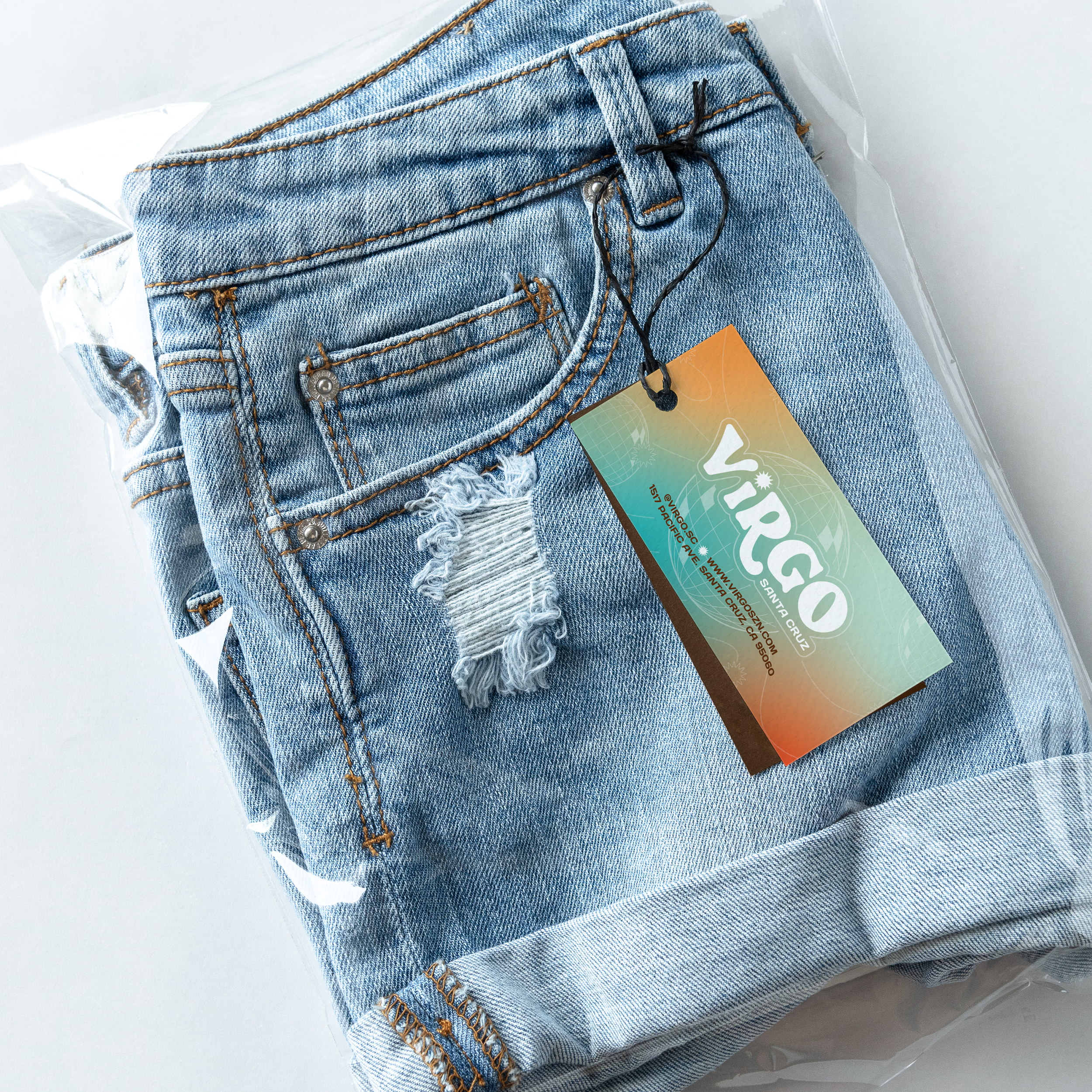
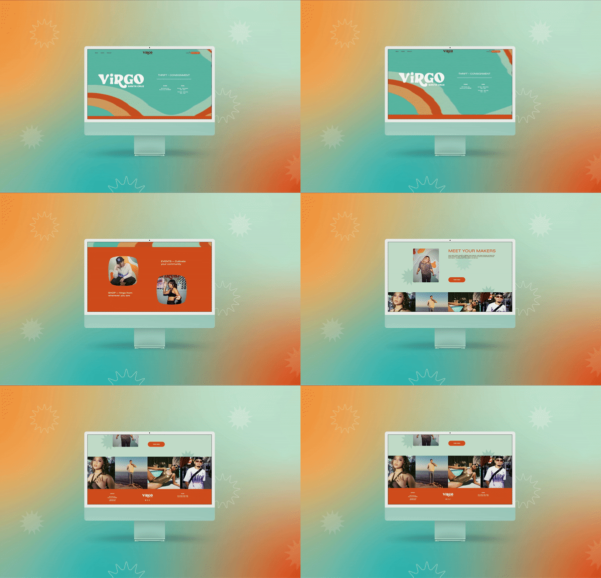
Virgo Santa Cruz is a community driven cooperative allowing local creatives to collaborate and sell at their brick and mortar. Virgo approached me to refresh their branding. My goal was to take their existing branding and elevate it to speak to a fashionable, aesthetic-focused Gen Z market that is inspired by 70’s, 90’s and early 2000’s fashion but through a 2020’s lens.
LOGO
Because this logo would be applied across digital, print, signage and more, it had to be more legible. So I reduced the contrast of curves, changed to a more streamlined and Y2K-esque typeface, and replaced the heart with a disco ball shine-shape for consistency.
COLORS
We decided to keep the existing brand colors very similar to their previous ones, just slightly more vibrant and harmonious.
TYPEFACES
Since Virgo nests dozens of local brands, it was important that Virgo’s branding was strong, but not overpowering. So we went with typefaces that were clean and modern, with a hint of Y2K nostalgia.


Merch and
Other Work
In addition to their brand refresh, I have worked on original merchandise and other social media projects. We decided that we wanted to allow customer-facing collateral to have the flexibility to be more experimental and loose than the main branding assets as it would be swapped out regularly. So we went with designs that were on the trendy side, but also had retro aspects to them for collection-based merch and social media collateral.


